I lived with blank walls for two years because I was terrified of commitment. What if I put holes in the wrong places? What if I hated it? What if it looked bad?
Then I finally just did it, and honestly, it transformed my entire apartment. Suddenly the space felt finished, personal, and like an actual home instead of a temporary landing spot.
If you’re staring at blank walls wondering what to do with them, let me help you figure it out without the analysis paralysis I went through.
Why Wall Decor Matters
Blank walls make a space feel unfinished and cold, like you just moved in even if you’ve been there for years. The right wall decor adds personality, makes rooms feel cozier, and gives your eyes somewhere interesting to land. It’s the difference between a house and a home.
You don’t need expensive art or a perfectly curated gallery wall. You just need something that makes you happy to look at and fills the space intentionally.
Solo Wall Decor Ideas
Sometimes you don’t need a whole gallery wall. One great piece can be enough.
Large statement art is the easiest solution for a big blank wall. One oversized piece above your couch, bed, or console table instantly fills the space and becomes a focal point. This can be a painting, photograph, poster in a frame, or even a tapestry. The key is going bigger than you think you need. A too-small piece floating in the middle of a large wall looks awkward.
Mirrors are functional and make spaces feel larger and brighter. A large mirror above a console table in an entryway, over a dresser, or even leaned against a wall creates impact. Decorative mirrors with interesting frames add visual interest beyond just reflection. I have a big round mirror above my couch that bounces light around my living room and makes the whole space feel more open.
Floating shelves give you display space for books, plants, photos, and decorative objects. They’re functional wall decor that you can change up seasonally or whenever you want. Install 2-3 shelves at different heights and style them with a mix of items. This works especially well in small spaces where you need storage but don’t have floor space for furniture.
Tapestries or textile wall hangings add warmth and texture that flat art doesn’t provide. A woven wall hanging, macramé piece, or fabric tapestry softens a space and works especially well in bedrooms or bohemian-styled rooms. These are usually lightweight and easier to hang than heavy framed art.
Wall decals or wallpaper create impact without commitment. Removable wallpaper on one accent wall changes the entire feel of a room. Wall decals in geometric patterns, nature motifs, or quotes add visual interest and are perfect for renters who can’t paint or make permanent changes.
Gallery Wall Basics
A gallery wall is just multiple pieces hung together as a cohesive arrangement. It sounds complicated but it’s really not once you understand a few principles.
The key is making it feel intentional rather than random. You want the pieces to relate to each other somehow, whether through color, subject matter, frame style, or overall vibe. But they don’t all have to match perfectly. In fact, some variation makes it more interesting.
Start with a focal point piece, usually your largest or favorite item. Build around that. Everything else should complement it rather than compete with it. If you’re hanging above a couch or bed, center your arrangement on that furniture piece. The gallery should feel anchored to the furniture below it, not floating randomly on the wall.
Leave 2-3 inches between frames as a general rule. Too close feels crowded, too far apart feels disconnected. Consistent spacing makes even mismatched frames look intentional.
Gallery Wall Layout Styles
The grid is the most organized approach. All frames are the same size arranged in perfect rows and columns. This works beautifully in modern or minimalist spaces. Use matching frames for maximum impact, and keep matting and spacing consistent. It looks clean, organized, and sophisticated.
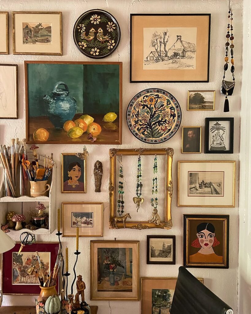
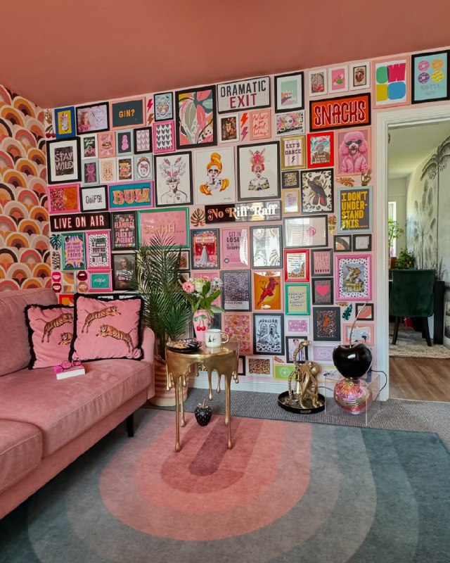
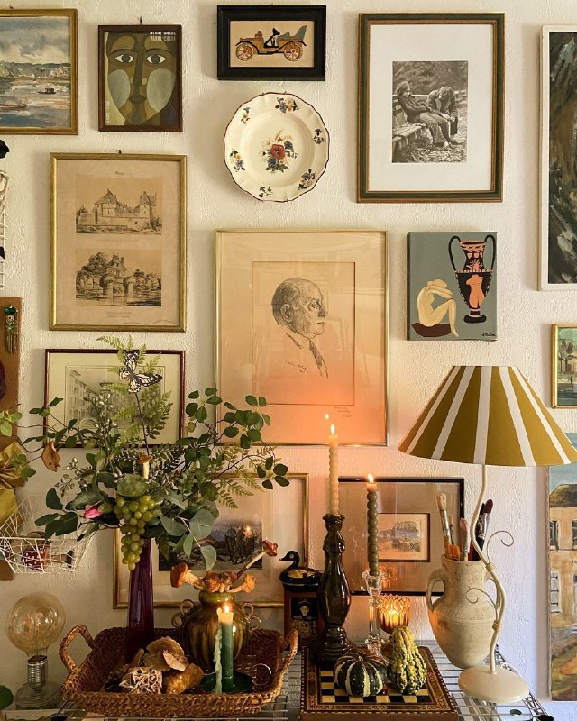
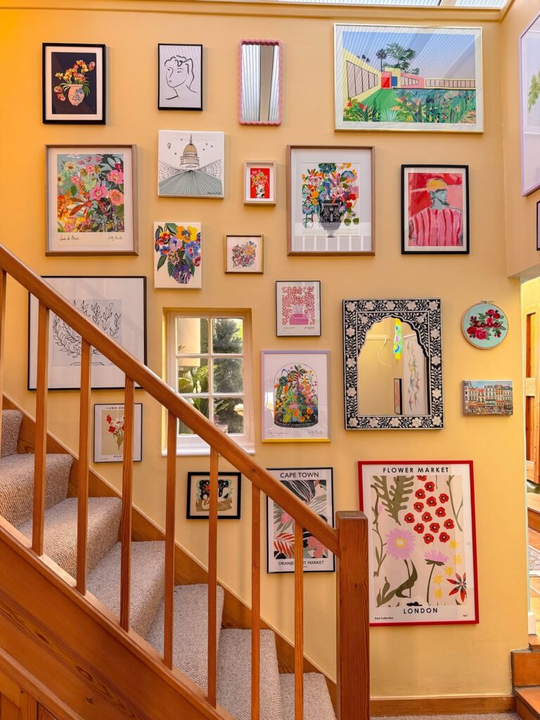
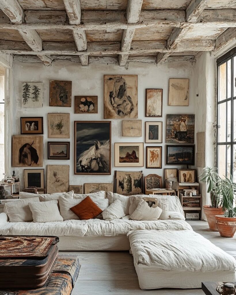
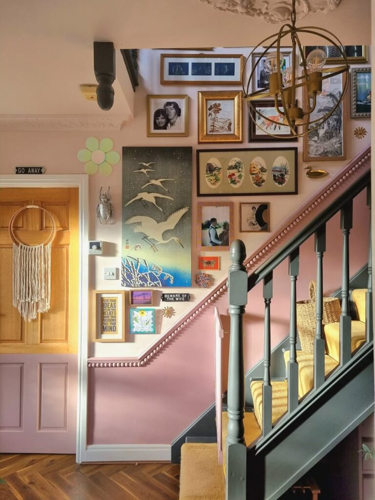
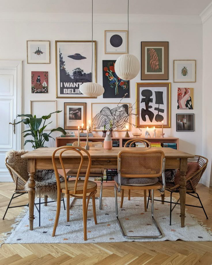
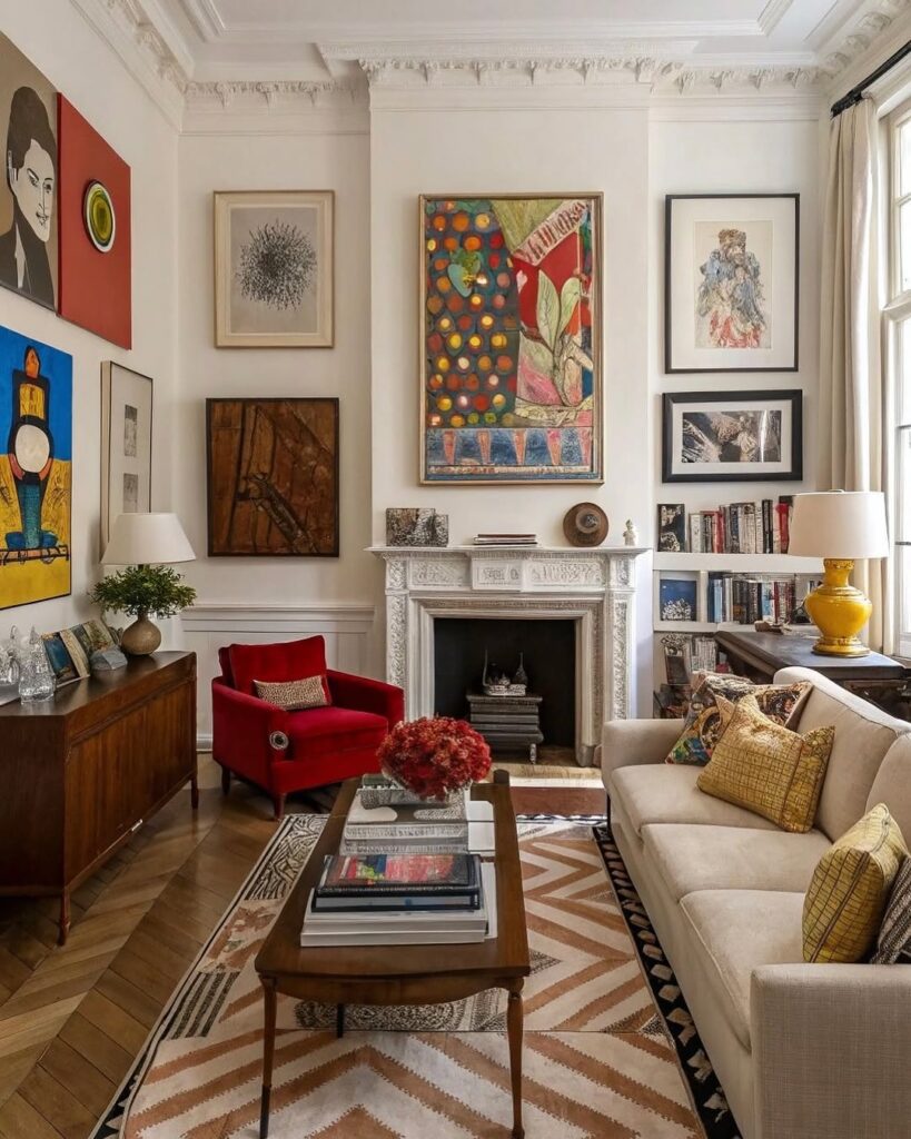
Salon style is organized chaos done right. Mix different sized frames and artwork with one unifying element like all black frames, all similar colors in the art, or all the same mat color. Start with your largest piece in the center or slightly off-center and build out from there. This works for eclectic or traditional spaces.
Linear arrangement keeps things simple with frames arranged in a straight line, either horizontally or vertically. They can be the same size or varied, but they align along one edge (top, bottom, or center). This is great for hallways, above a console table, or in narrow spaces.
Asymmetrical but balanced looks organic and collected over time. Pieces are different sizes but the overall visual weight feels balanced. You might have a large piece on one side balanced by several smaller pieces on the other. This takes more planning but looks effortlessly curated.
Corner arrangement uses a corner as the anchor point and builds out from there. This is perfect for awkward corners or spaces where traditional layouts don’t work. Start in the corner with a medium-sized piece and work outward in an organic shape.
What to Include in Your Gallery Wall
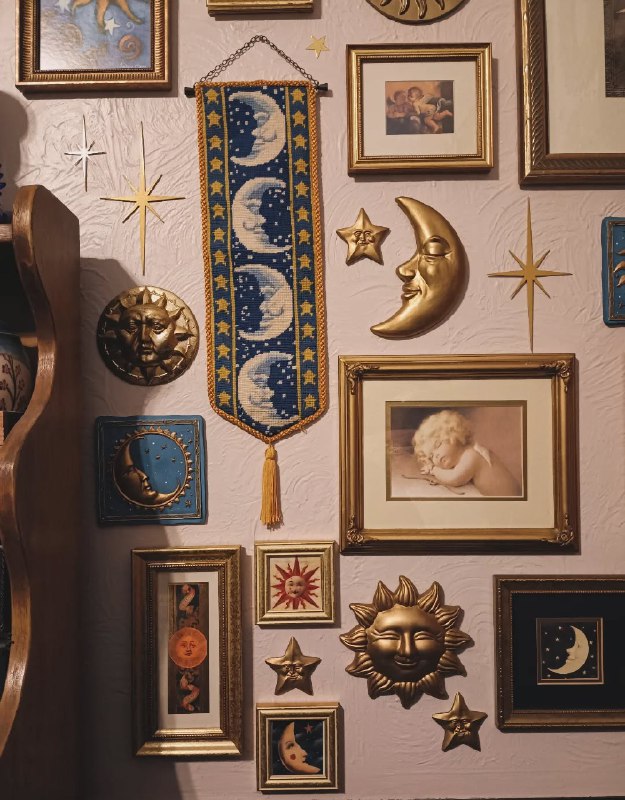
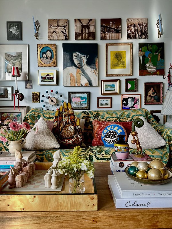
Mix different types of art and objects for visual interest. Framed prints and photographs form the backbone, but don’t stop there. Add framed fabric or wallpaper samples for texture. Include small shelves with 3D objects like small plants or sculptures. Hang mirrors within the arrangement to add depth. Incorporate letters or words, either framed quotes or dimensional letters. Mix in personal items like framed concert tickets, postcards from travels, or pressed flowers.
I have a gallery wall that includes art prints, family photos, a small round mirror, and a shadow box with shells from a beach trip. The variety makes it feel personal and collected rather than bought all at once from one store.
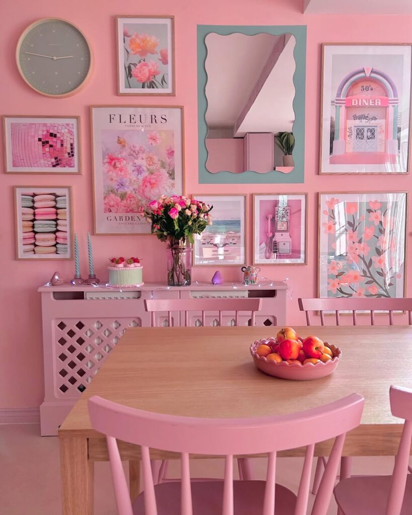
Color Coordination
You have two main approaches. Either go monochromatic with all frames the same color and artwork in a similar palette, or embrace colorful variety but make sure colors appear multiple times throughout the arrangement so nothing feels random.
If your frames are different colors, make sure the overall balance feels intentional. Maybe half are black, a third are wood, and a few are white. The variation adds interest but there’s still a pattern.
For artwork, pulling 2-3 colors that repeat throughout creates cohesion even with different subjects or styles. You don’t need everything to match, you just need a thread that ties it together.
The Layout Planning Trick
Before putting holes in your wall, trace each frame on kraft paper or newspaper and cut out the shapes. Tape them to the wall and move them around until you love the arrangement. This lets you experiment without commitment. Take a photo of your final layout to reference when hanging.
Alternatively, lay everything out on the floor in your desired arrangement, measure the spacing, and transfer those measurements to the wall. Some people even create a template on poster board, mark where nails go, tape it to the wall, and hammer through the template.
Beyond Traditional Frames
Clipboards or clip frames let you easily swap out art. Hang clipboards on the wall and clip different prints to them seasonally or whenever you want a change. This works great for kids’ art, inspirational quotes, or rotating your own photography.
Floating frames with no visible borders give a modern, minimal look. The art appears to float on the wall with just a thin acrylic or glass edge.
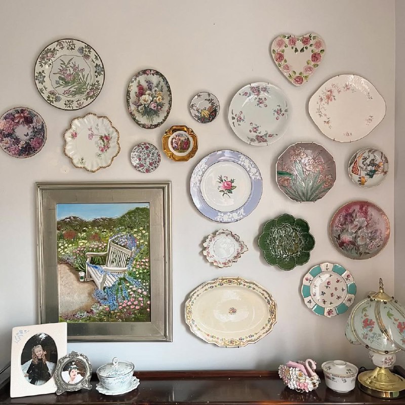
Plate wall uses decorative plates hung in an arrangement. This works beautifully for vintage plates, colorful modern plates, or a collection you’ve gathered over time. Plate hangers make this easy and damage-free.
Shadow boxes display 3D objects like shells, jewelry, small plants, or memorabilia. Mix them into a traditional gallery wall for depth and interest.
My Gallery Wall Evolution
I started with just three frames above my couch. Then I added two more. Then a mirror. Then another small frame. It grew organically over about six months as I found pieces I loved. Now it’s about twelve items total and I’m really happy with how it turned out.
The gradual approach took the pressure off getting it perfect immediately. Each addition felt manageable, and I could see how each piece worked with the others before committing to the next one.
My biggest lesson was that bigger is better. My first attempt had frames that were too small for the space, and it looked wrong. Going up a size or two in frame dimensions made everything look more proportional and intentional.
Common Mistakes to Avoid
Hanging everything too high is the most common error. Art should be at eye level, which is generally 57-60 inches from the floor to the center of the piece. For gallery walls, aim to have the center of the overall arrangement at eye level.
Using frames that are too small for the wall makes the space look even emptier. Go bigger and don’t be afraid of scale. Frames that are too matchy can look catalog-perfect but impersonal. Mix it up a bit while keeping some unifying element.
Ignoring the space below is another issue. Your gallery wall should relate to the furniture beneath it. Generally, leave 6-8 inches between the top of a couch or console and the bottom of your gallery wall.
Budget-Friendly Approach
Thrift stores are goldmines for frames. Buy mismatched frames and spray paint them all the same color for a cohesive look. Print your own art from free sites like Unsplash or buy affordable prints from Etsy, Society6, or even Target. Frame fabric, wrapping paper, or pages from old books as instant art.
Mix expensive pieces with budget finds. Nobody can tell which frames cost $3 and which cost $30 once they’re all hung together. I’ve spent maybe $100 total on my gallery wall by shopping secondhand and printing my own art, and it looks way more expensive than that.
Starting Small
If you’re overwhelmed, start with three frames above your couch or bed. That’s it. Get comfortable with that, then add more if you want. Sometimes three is enough.
You can also start with temporary solutions like washi tape frames or poster putty before committing to nails. Test layouts, live with them for a week, and then make them permanent when you’re sure.
The perfect gallery wall doesn’t exist. The best one is the one that makes you happy and feels like you. Your walls are telling your story, so make sure it’s a story you actually want to tell.